Design
Later in my career, I was surprised to discover I had a facility for design work combined with branding processes gleaned from from years at Leo Burnett. I focused on local and not-for-profit companies, developing logos and creating designs for Clesen Wholesale Florists, Eiesland Builders, ICRT Research out of Northwestern University, Harris Bank, Horton Insurance, FMT and New Millennium consultancies, and more.
GiftGold
All things gold - online. GiftGold's plan was to change the way people shopped for jewelry and other high-end valuables. It was an online gift-card site that drew clients by combining advertising programs and sources at a fraction of the normal cost to individual retailers, driving customers to local businesses where they could be confident that the retailer had the item(s) they wanted at the price they wanted.
Northwestern University
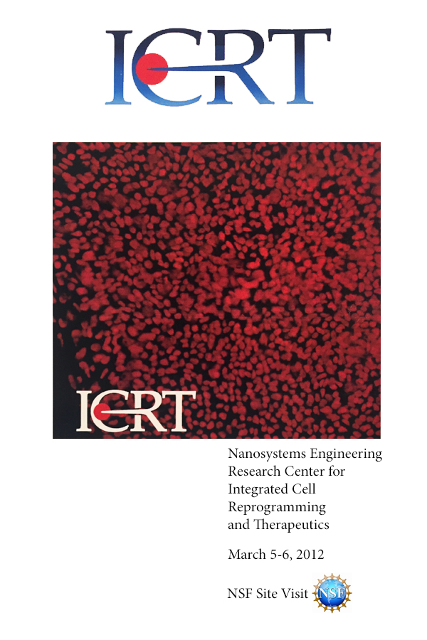
Cell Reprogramming and Therapeutics? These scientists were putting x inside of y—that much I figured out. And they were doing it on a nano level. The thousand tiny red dots pictured here are reprogrammed cells, taken with a powerful microscopic camera. The scientists were quite happy with how the simple artist/designer (me) managed to get the idea across using the acronym.
New Millennium Consultants
The promotions agency I was consulting for at the time wanted to grow into a branding, business-to-business and consumer agency. The client loved this work—but the agency was not chosen in the end.
Eiesland Builders
Based in Glenview, IL, Eiesland is one of Illinois' premier building and remodeling contractors, with their own woodworking shop where they specialize in custom-built cabinets, shelving, trim and more. They are the very definition of quality and class, and wanted a communications plan—and logo—impressed clients with the promise of what was to come.
FMT Consultants
The graphic represents what FMT does: it enters a client's organization, gets to the heart of the problem, and makes an impact by improving their day-to-day operations. The fonts help complete the picture by blending refinement (serif face) and sturdiness (sans serif). Job done!
Mattaliano Design and Furniture
Huge high-rise apartment and office complexes. Restored classic buildings re-purposed for the modern era. Anchor tenants whose retail businesses border well-trafficked public spaces. Who fills those spaces? Who designs the furniture plans? Who builds custom chairs and tables and sconces etc. for those spaces? Mattaliano, that's who. Forward-thinking, with the utmost respect for tradition. Exactly the feeling this logo transmits.
Utilities, Inc.
In remote and rural areas of the U.S., getting sufficient supplies of essential energy sources - water, gas, electric - is a challenge. Meeting the needs of these communities is the cause taken up by Utilities, Inc. an organization that leverages the resources of local delivery systems with the global expertise of energy veterans. The three elegant shapes represent the energy sources, organized to create the illusion of a human head in the negative space - a strong and memorable branding image.
Angles
Under their previous name - Links - this unassuming but influential youth counseling service in Northfield, IL provided essential group therapy, medical, intervention and emergency services for LBGTQ youth. I guided the organization through every stage of their rebranding process: name search, stakeholder buy-in, logo design and communications design and strategy. The three parts of the "A" represent the three services of the organization, expressed in the tagline: "for sexual health, identity and education."